A Radical Architecture
An Interview with Juliette Desorgues
We caught up with Juliette Desorgues to hear more about Austrian magazine Bau and how its radical ideas remain relevant today.
In the 1960s and 1970s Bau: Magazine for Architecture and Urban Planning became a platform to explore new experimental ideas which considered architecture beyond mere concrete and ventured instead into the realms of art and politics. To coincide with our ICA Fox Reading Room exhibition Everything is Architecture: Bau Magazine from the '60s and '70s, we caught up with ICA Associate Curator Juliette Desorgues to hear about the process of curating the show and the significance of the magazine.
What first drew you to Bau magazine and what were your motivations when creating the show?
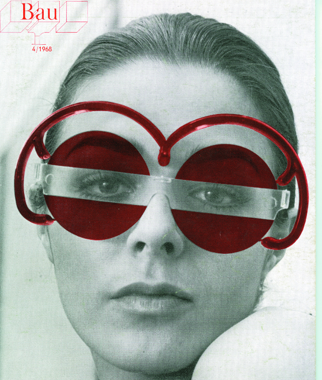
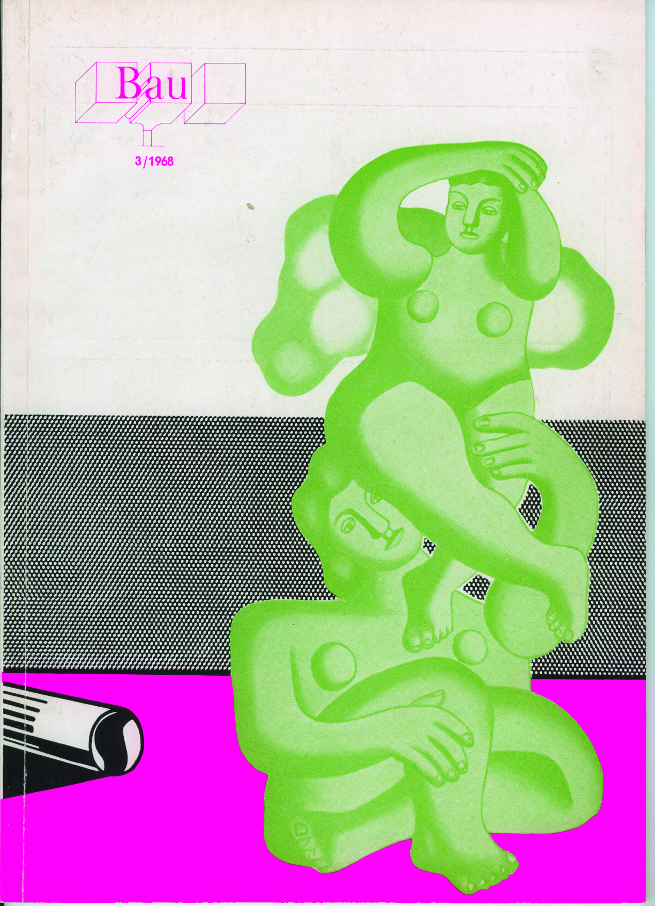
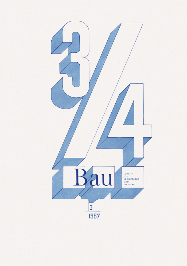
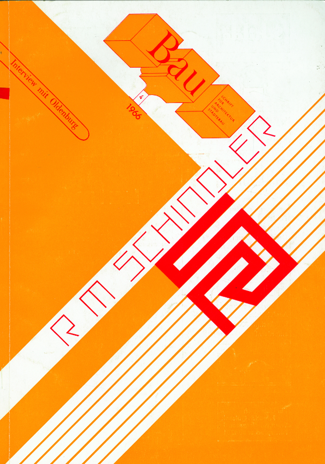
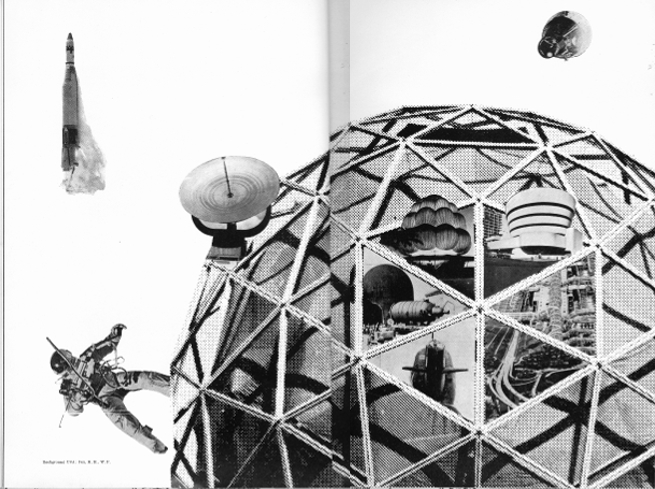
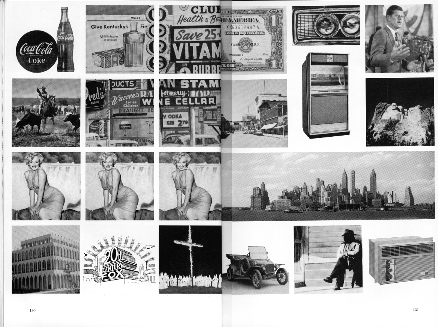
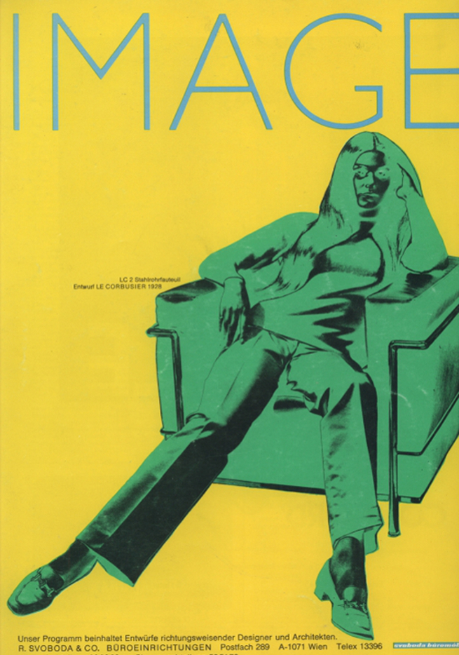
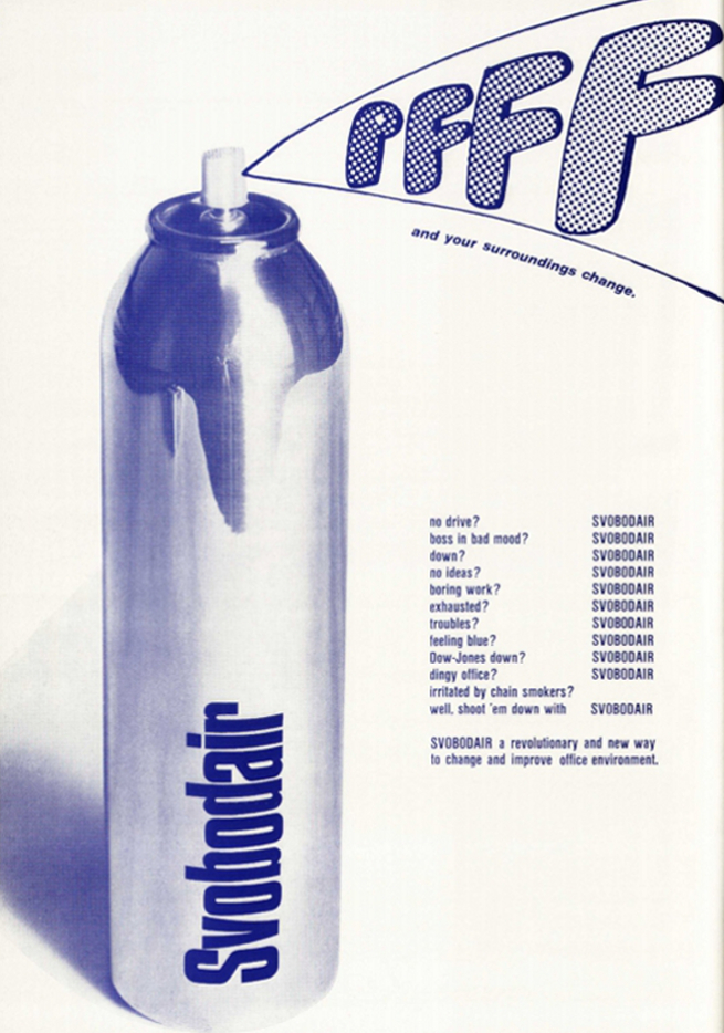
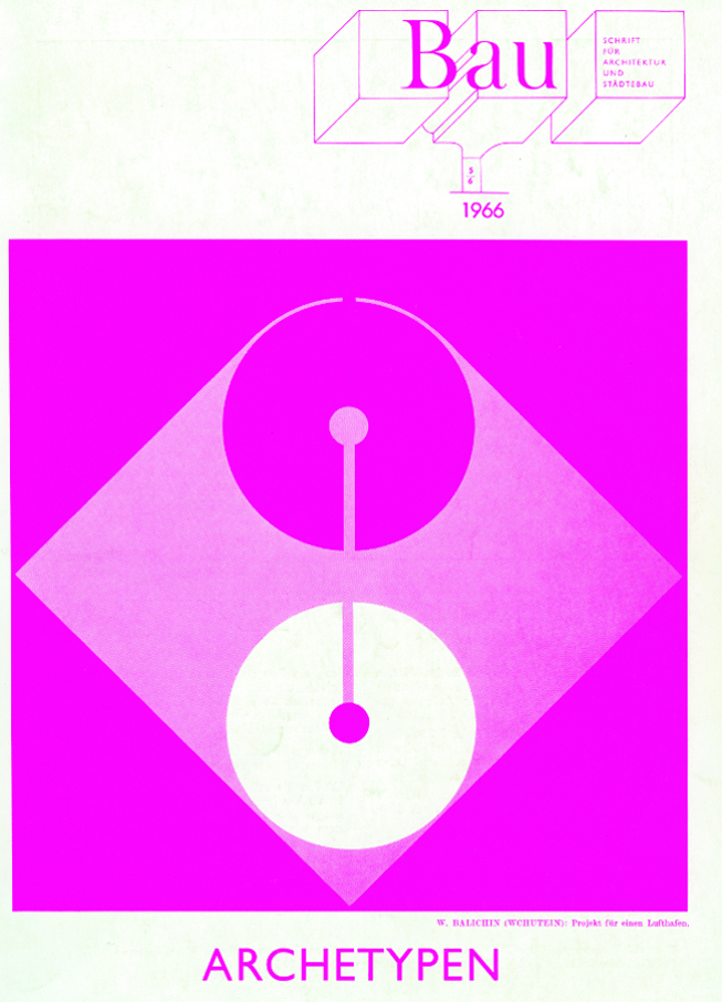
I came across the magazine some years ago when living in Vienna. I was first struck by its design - with its bold colours and use of found imagery and collage, it feels very contemporary. It's interesting how this architectural magazine touched on so many different issues: popular culture, politics, graphic design, fashion and art. This interdisciplinarity very much defined the 1960s and 1970s and is still relevant today.
I also realised that there had never been a proper presentation of Bau in the UK - it was still relatively unknown. This is probably due to the fact that the magazine was, for the most part, written in German, apart from the odd text or interview with figures like Claes Oldenburg and Buckminster Fuller.
So, it felt like the right time to be presenting this important publication. Several key texts have been translated into English for the first time so that both the magazine's design and content are now accessible.
The magazine had a reputation for being experimental in its content and design. What were some of its most radical moments?
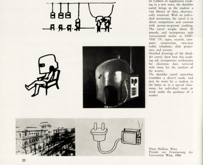
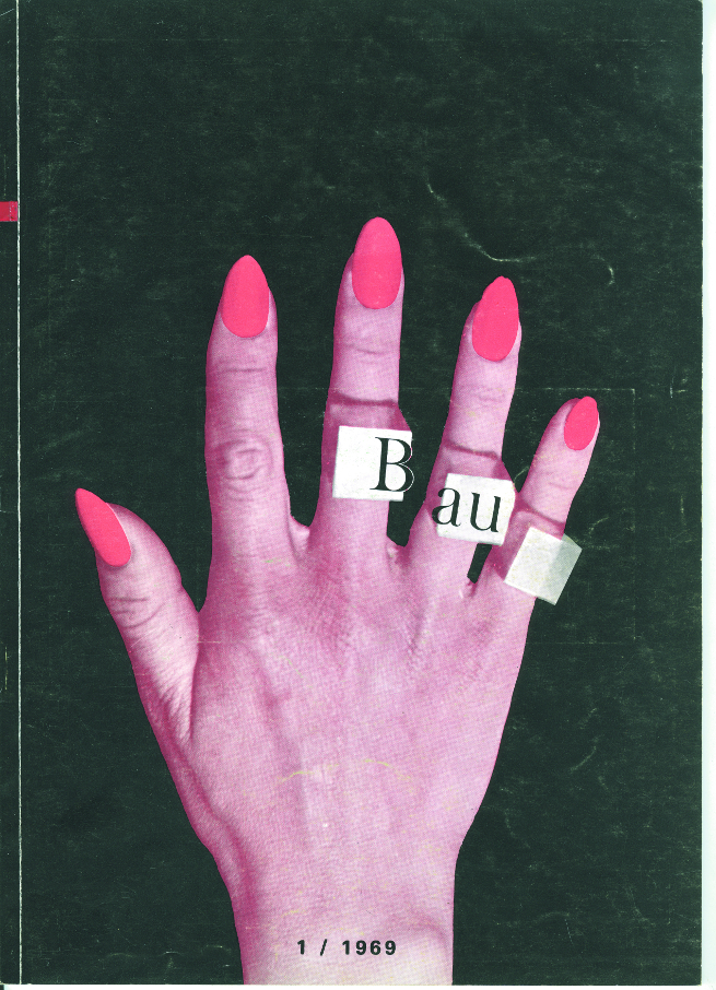
For me there are two key moments: the first is a page from issue 1 of 1969 that shows various proposals for an architecture that would replace the university or school as the buildings for learning. Among the proposals is American architect Charles Colbert’s pioneering Shoulder Carrel (1966), which was conceived as an electronically-controlled helmet that produces information for people to read. Also included is Hans Hollein’s Telematic University from the same year, which proposed the TV set as a form of learning. In our technology-led and information-obsessed society, it’s amazing how contemporary these drawings are!
The other can be found in various issues that celebrate work by key Austrian figures such as Josef Hoffmann, Adolf Loos, Rudolph M Schindler and Ludwig Wittgenstein. While this could be seen as quite a conservative move particularly for a magazine interested in contemporary ideas, these articles were actually very bold considering the fact that these architects were largely unknown at that time, following a period of cultural amnesia during the Second World War, when Austria was annexed to the Third Reich. These articles helped address this gap in cultural memory and established these figures as some of the key architects of the 20th century.
The magazine’s interdisciplinary approach to architecture seems ahead of its time, yet it is now 50 years since it was first published. What was the magazine’s significance in the 1960s and 1970s?
In the 1960s and 1970s there was a flourishing of ideas around art and architecture in Austria, and particularly in Vienna. Bau became a catalyst for these ideas, both locally and internationally. It was also a source of inspiration for a younger generation, including architectural collectives COOP HIMMELB(L)AU, Haus-Rucker-Co, Zünd-Up and Salz der Erde, which combined collage, performance and film in their work in a radical way.
The magazine has many great cover images. Which are your favourites and what was their significance?
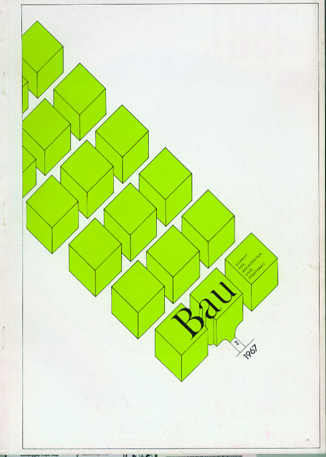
I love the simple yet bold design of covers such as issue 2, 1967 or issue 1, 1969 that play with colour, form and found imagery. They feel timeless.
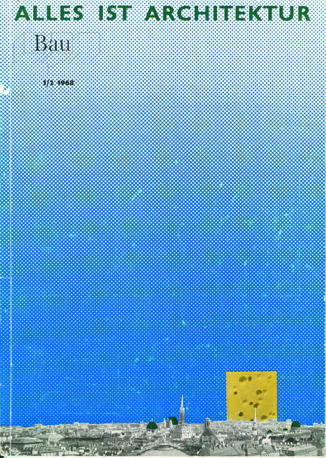
My other favourite is that of issue 1-2, 1968 which was designed by Hans Hollein, and included his seminal manifesto Everything is Architecture. The cover shows an aerial view of the city of Vienna, truncated by a large block of Emmental cheese. The term Emmentaler suggests a bad design in Viennese jargon, a tongue-in-cheek nod to the large-scale modernist housing projects of the 60s. This particular cover highlights the sense of playfulness and experimentation that defined both Bau and the work of Hollein himself. ■
Everything is Architecture: Bau Magazine from the '60s and '70s runs 29 July - 4 October 2015.
This article is posted in: Blog, Exhibitions, Interviews
Tagged with: Bau Magazine, Juliette Desorgues, Everything is Architecture, Exhibitions, events
