The Arts Educator Part 1: You've Never Heard of the ICA? Who is Richard Hamilton?
Ahead of a Teacher's Preview of Richard Hamilton at the ICA on Thursday 27 March, artist, art historian and educator Rita Cottone reflects on the experiences gained by her students on a recent trip to see the exhibition.
I joined my A-Level Art & Design students from Drayton Manor High School in the ICA Café, and questioned them about their experience of viewing the show: a recreation of Hamilton’s 1957 installation an Exhibit, alongside Man Machine and Motion, another installation which is being recreated at the ICA, from its initial staging in 1955.
None of my A-Level students had ever heard of the ICA, to my amazement, and some had never even heard of Richard Hamilton, even more to my amazement. They were briefed before the visit about both: the ICA as an iconic establishment of contemporary art, and Hamilton’s current retrospective taking place across the ICA and the Tate Modern, showcasing the artist’s phenomenal output of paintings, prints, collages and installations from the 1940s to his final work in 2011.
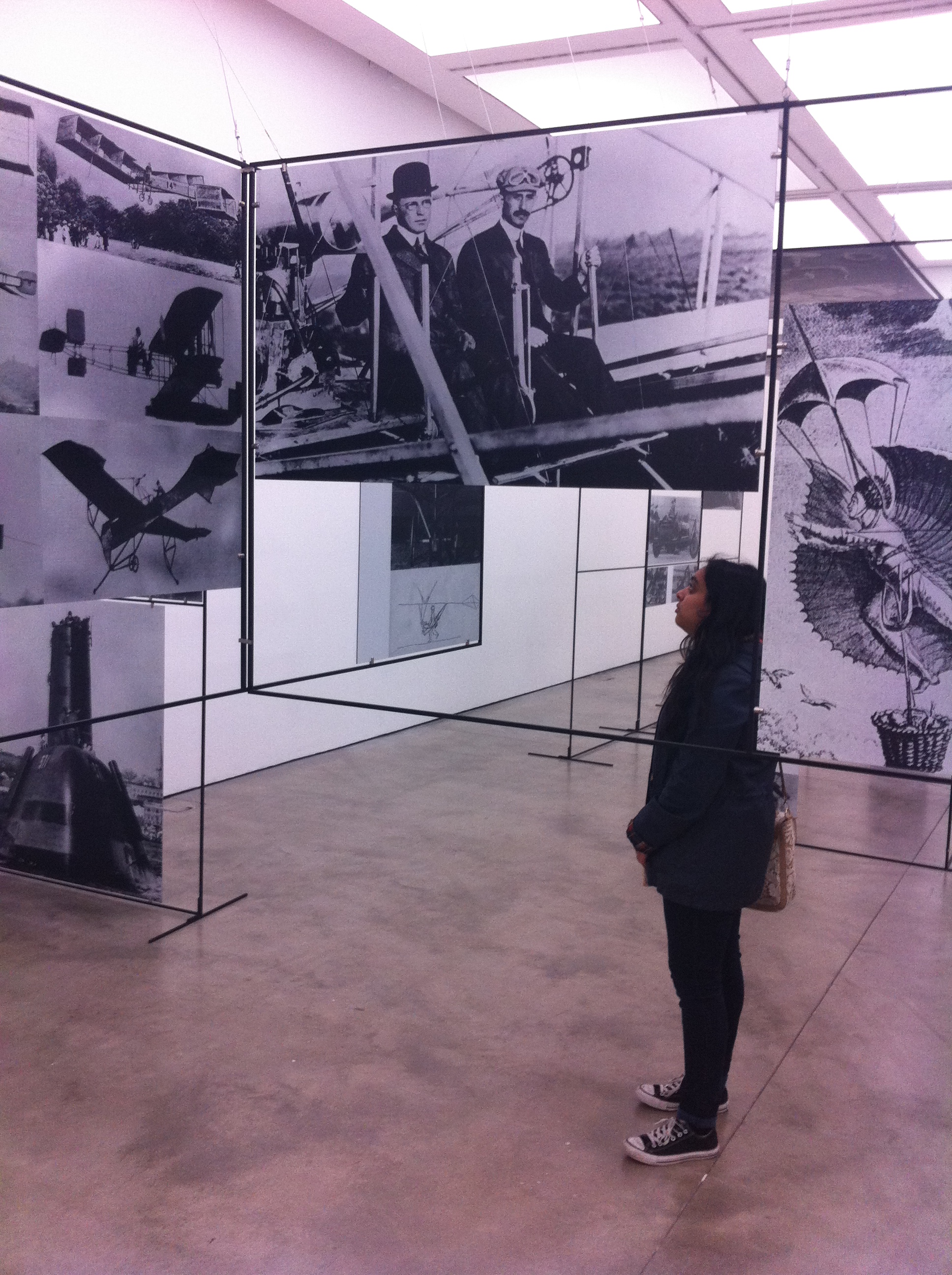
I was given a Teacher’s pack by the ICA, which was put together in collaboration with educators at the Tate and this gave me a good starting point for activities and discussions with my group. We talked about Man, Machine and Motion. The students commented on the intensity of the piece. They noticed how the works are not merely presented flat on the walls of the lower gallery; the 200 or so images are attached to 30 steel frames and they are above you, at your feet and behind you, as you move around. We saw men (and women) in motion: skin-divers, motor racing, exploring space, riding scooters and bikes and flying planes. The range of images, according to Hamilton, is an attempt to explore man's power of motion to ultimately conquer time and distance in the ‘aquatic, terrestrial, aerial and interplanetary’ environments. Space-related images are, fittingly, suspended on panels above, the students noticed, so that you have to look up to look at images of exploration of what is above. Aircraft images are displayed on an ‘H’ group of frames suspended four feet above the ground. The configuration is provocative and makes the viewer want to explore, much like a child presented with a climbing frame, which it resembles somewhat. The students commented on how the openings between frames allow you to see other people looking at the work, which makes you aware of yourself viewing the work and aware of how others are using the space. Several students stopped and smiled at one of the images which featured a dated diagram of space exploration and a list of hazards in space: meteorites, cosmic rays, weightlessness, glare, disorientation, irritability and fatigue. The consensus amongst students was that the images were interesting as access to the past, but what was more interesting was the way it was presented.
One of the general discussion points was to do with the relationship between opacity and transparency, and what the artists were trying to achieve through the positioning of panels. The ensuing discussion showed that my students had been acutely aware of this. They suggested that the spaces between the steel structures in Man, Machine and Motion pointed to the future possibilities of technology, to the unknown. Some even made suggestions on what images they would add – a Tesla Model X, Branson’s Space exploration project Virgin Galactica. Some likened it to a Pinterest board or Facebook, where people create visual displays of their lives. For others, those gaps alluded to the idea of how the process of looking back features omissions – information is often missing; sometimes those gaps are filled in as research emerges but often the picture is incomplete.
Man, Machine and motion was viewed by my group as a good warm-up to an Exhibit. The latter was a collaboration between Hamilton and two members of The Independent group, artist Victor Pasmore and writer-critic Lawrence Alloway. In an Exhibit the artists present a modular hanging system of sheets of clear and coloured acrylic – a similar set up to Man, Machine and Motion. It came into existence, incidentally, from a remark that Pasmore made to Hamilton that Man Machine and Motion would be very good if it weren't for all those photographs. My students noticed that as you walked around you were able to see other people reflected in the panels, as well as other parts of the installation. The reflections in an Exhibit gave a heightened awareness of the space. One of my students commented that “at first you think it's just squares but the reflections make it more interesting and when you're in there you're curious.” They concluded that one’s viewpoint is extended through the use of reflections. I tried to convey to them how Hamilton was fascinated with the process of viewing and how this could be seen throughout these two works, and throughout his entire oeuvre. Had I been able to take them to the rest of the retrospective at the Tate Modern I would have shown them his brilliant work Lobby, a painting featuring a complex interior with several vanishing points, mirrors and two flights of stairs. In 1988 when it was displayed, it was made even more spatially complex by Hamilton’s addition of an installation which replicated the space within the painting.
The poster of the exhibition of an Exhibit refers to it as a game, ‘a maze, a ceremony completed by the participation of the visitors’. It was designed to be interactive, to encourage play, and to force participants to ‘create their own configurations'. My group of students certainly got involved. They walked around freely, marvelled at the reflections of the panels and squeezed through narrow spaces. At times they stopped and took in the whole view. They changed direction, went back to certain points of interest and chatted about their views. I was aware of them watching each other navigate the space. One student commented that, “there is a limit to what you can do in Man, Machine and Motion, it is showing you what you know, whereas an Exhibit gives you endless possibilities.” Each person sees a different composition generated by their own exploration; it is a collaboration between artist and participant. One student had in fact visited the exhibition the day before, and felt that he wasn’t able to fully participate as he had been on his own. He knew what he wanted to do - to squeeze through certain gaps - but felt that doing so on his own would look odd. I had a similar experience when viewing Hamilton’s installation ‘Fun House’ at the Tate Modern. The piece features a microphone and I was keen to test it, to see the effect, but I was on my own and stopped myself. I reflected on this and ultimately, art that requires participation is better as a shared experience, perhaps because it requires an element of regressing to a child-like state. One student agreed with this, stating that in an Exhibit, “you feel like a child as you are invited to play.” This was exactly what Hamilton had intended and Alloway’s words on the 1957 poster for the exhibition summarise this: ‘the gallery resembles a tennis court, or a hopscotch grid, a playground within which special rules operate.’
In discussing the similarities and differences between the two works (another discussion point taken from The Teacher’s Pack), Hamilton’s fascination with nature and technology emerged. I spoke to them about how his readings of D’Arcy Wentworth Thompson’s 1917 publication ‘On Growth and Form’, inspired his exhibition ‘Growth and Form’, which was shown at the ICA in 1951, and which is recreated at the Tate Modern. I explained to them that Hamilton’s early work gives the viewer an understanding of the artist’s fascination with technology and how it could be tied to artistic practices. He believed that artists could learn from the enlargement of their environment through new imaging technologies, for example. One student commented that in Man, Machine and Motion, Hamilton is also encouraging the enlargement of one’s historical view by presenting a series of images from the Renaissance onwards. Another student commented that, “looking back at the advances in technology up until the 1950s highlights how much things have changed since then.” Hamilton is asking us to look back in order to look to the future. One of the excellent activities suggested in the Teacher’s Pack is to make a contemporary version of Man, Machine and Motion. My A-Level group talked excitedly about their ideas: about the accelerated pace of technology since the 1950 and the social changes linked to this. They questioned whether they could incorporate the biggest machine of all - the internet and discussed how this had directly affected the ability of man to conquer all territories. They mentioned present day space exploration by companies such as Sierra Nevada Corporation, Orbital, Spacex and Virgin Galactic. One student suggested a Boris Bike.
There was a unanimous appreciation and excitement about Hamilton’s installations at the ICA. When an Exhibit was staged during the 1950s the critic Ivan Geffen commented that, “If it proves anything at all it is only what two subtle and sophisticated minds can get up to when they refuse to take themselves too seriously and invite others to behave likewise. Some solemn spirits will doubtless disapprove of it. I welcome its gaiety, levity and wit." My students certainly shared Geffen’s view. They enjoyed the openness of the experience and were amazed that an Exhibit was first exhibited in the 1950s. They understood then that Hamilton had anticipated the success of the wealth of installation art that they see today in the capital. They were intrigued by the differences between the two installations, and how the latter had come to exist through the first. I explained that Hamilton was interested in how art develops through a process; evidenced by his tendency to create several versions of a piece rather than a single finished work. This, approach, perhaps, was informed by his understanding of how natural forms evolve, through his readings of ‘On Growth and Form’. We must remember that Hamilton was also a teacher and during his career he developed an art course which promoted the idea of an organic evolution of art, through process. If my students took anything away, it was that Hamilton was a master of synthesis: he took ideas from nature and technology, from artists working in Europe and America and he experimented with different techniques and processes. He sought to learn from the changing world around him and from history.
The ICA’s exhibitions are notoriously challenging and content for younger students is at times an issue because of the explicit nature of images. Educators often steer clear of it - Keep Your Timber Limber for example, shown last summer, was a collection of drawings, many of them homoerotic, that would have been unsuitable for younger audiences. In the last year there have been several missed opportunities for GCSE and A-Level visits, however: The Hamilton exhibition, the annual Bloomberg New Contemporaries exhibition and the Grantchester Pottery display in the ICA’s smaller exhibition space, the Fox Reading Room are just a handful of examples. Of all the cultural institutions in London this is certainly one that should appeal to A-Level students, and educators should certainly add it to their school-visit-list, or at least mention it to students. I was deeply concerned that my students had no knowledge of the institution but then again I am not surprised as not much noise has been made for that age group in recent times. I hope this changes as the ICA has the infrastructure to support school visits – a large auditorium, an education room, and a vibrant café. I was impressed with the in-depth Teacher’s Pack for the exhibition and the range of exciting and relevant activities that were suggested. It was invaluable to the success of the visit. The ICA also has a cinema, which is showing two films about Hamilton in March. One of my students logged on to the website and was impressed to see one of his favourite bands was performing there. And then there is Art Rules, the ICA’s new online venture whereby audiences can add their own ‘Art Rule’ to a twitter-like forum, and debate with the group why they chose it. I love the way it is presented on screen like bubbles popping up to the surface and nudging others out of the way. I’ve asked my group to add to this site. When I see them next week I hope to see some informed comments and nothing along the lines of “What? I’ve never heard of it”.
By Artist, Art Historian and Educator Rita Cottone
This article is posted in: Articles
Tagged with: Richard Hamilton, Education, Teachers
